
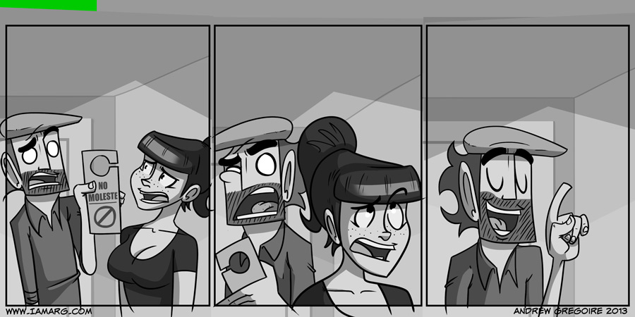
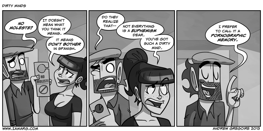
HOW TO ARG.
Step One – draw a penis.
Step Two – post it to the internet.
GOOD NIGHT FOLKS!
All joking aside, I’ve been wanting to write up a little tutorial about how I make the comic for ages now. People seem to be interested in how I’m able to make a comic so quickly. I take about 1 1/2 to 2 1/2 hours to make a comic these days (not including writing). So hopefully this article has some nugget of info you can take away from it, or at least it’s an interesting look into how I create. I’m going to do how I approach writing a strip in a separate tutorial, as writing is an entirely complicated beast in it’s own right.
So here’s how I go about creating an I am ARG strip.
What I use.
A Tablet PC – An HP Elitebook to be exact. It’s like a portable Cintiq. It allows me to draw to directly on the screen and see the line I am drawing underneath the tip of the stylus. I’ve never been able to get used to a standard Wacom tablets.
Photoshop CS5 – I use Photoshop exclusively now. I used to use Autodesk Sketchbook pro because it was easier on my Tablet PC and has some really great features for a tablet pc (zoom and move in the same tool, really nice pencil tools.) I’ve made the move to photoshop because lettering in Sketchbook pro is a hassle. Also the technique I use to flat doesn’t work in Sketchbook.
An iPhone – I am constantly writing. I’m always coming up with ideas and the only thing I have with me at all times is my phone. So I’m constantly writing ideas and jokes into the iPhone’s notepad. I know there’s other note taking apps out there, I’ve just gotten used to always using the notepad, plus it saves my notes to my Gmail account.
Gmail – Where all my notes go to! Handy access to every little idea I’ve ever had.
SugarSync – SugarSync is a Dropbox like service that allows me to store the comics and working files online. It’s always smart to keep your files backed up. Dropbox works just as well.
The Process
Uh oh…
I start with an empty template. Which is effin’ daunting. This could be the best comic I make or a complete dud. It’s a 300dpi file, which makes it ready for print and it’s already got the credit and website info. All I gotta do is put the funny in it.

I’ll copy the dialogue from my script in my Gmail notes and paste it into the template. Making sure the pacing of the dialogue works and there’s plenty of room for the art. I figure out the beats I want to hit and if the joke is working or needs some punching up. I also think “How is the reader going to read this”. Where is their eye going to go next naturally”. Are the expressions in this panel matching the tone of the dialogue? Is there run on sentences? Too many instances of the same word? Are there GIANT WALLS OF TEXTS? Extraneous wording? I ask a lot of questions of myself while drawing.

After getting the dialogue I’ll start with a blue line sketch in Photoshop. I use a 20px brush size and set the brush opacity to around 35% and rough out the composition, character positions and rough acting. Here I am trying to get the feel of the comic down. I’ll spend more time on roughs than any other part of the process (besides writing). This is the planning stage and everything I do right here means less time later on. I like to treat panels as shots and set up scenes as if they were to play on tv or in a movie. I try to avoid the usual 2 talking heads scenario, but comedy lends itself really well to this shot setup. You’ll notice a lot of Webcomics use this shot setup including this one.

I then I do a red line drawing over top, using the same brush settings from before. This is to tighten up some of the facial details and some of the hard things to straight ink like hands. At this stage I’m looking for anything that’s odd, like hands that are too big, weird perspective issues or anything that would look odd if inked. If any posing needs to be pushed I’ll select the area and use the Warp Transform tool to push the posing of certain characters or elements like arms. Warp Transform tool is awesome and you should use it.
Inking

After all the roughing is done I make a new layer above the rough, Lower the opacity of the rough work and start inking. I use a 10px-15px brush and make sure that the Spacing is set to 1%. This gives you a nice even line. Photoshop’s default brushes set the spacing to 25% which makes the line a little jagged. I’ll use a thicker line for characters closer to the “camera”

When I ink I use large brush stokes. I even over shoot the intended length of a line. It tends to give me straighter lines and allows me to work faster and more confidently. I know a lot of comic guys do the whole “Ink a line/Ctrl-Z/Ink again/Ctrl-Z/Ink-again” thing until they hit a perfect line. I’m not so concerned with a perfect line. I actually rarely undo any of my inking unless it’s noticeably terrible. I draw from the elbow rather than from the wrist and drawing away from my body. Drawing towards me tends to curve the line inward and down. This isn’t a hard and fast rule. Some people like drawing towards themselves and find that gets straighter lines. It’s a preference really. The main thing is it’ll take practice to get a nice line. I’ll draw through objects to ensure a straight continuous line and then go back and erase any “burrs” or extra lines.
Flatting
Flatting used to be my most hated part of making the comics. That was back when I was using Sketchbook Pro. Then John Wigger of Zombie Roomie showed me a way of flatting that makes everything quicker.
First I create a new layer underneath the inking and fill it with solid neon green.The importance of this will be evident later. I create a new layer on top of the green layer to use for the flat colours.
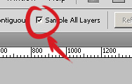
Using the magic wand tool with “Sample all layers” checked. I select an Area that I want to fill with a solid color and then I go to Select -> Modify -> Expand and then expand the selection by 2-3px. And then go to Edit -> Fill and fill with with the foreground color and then deselect.
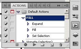
I’ve made this into a recorded action so all I have to do is select the color I want, select all the areas I want and then hit play and it’ll automatically expand and fill with color underneath the art work. It saves me a bunch time and is the quickest way to flat colors I know of.
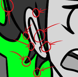
Now you’re probably wondering why the neon green? Well the above flatting process isn’t perfect. You’re going to have areas where the fill doesn’t reach. So you’re going to have to go and paint them in. The neon green brings out these areas where they normally would hide if the BG was white. It’s usually not bad unless you have a lot of triangular negative space or if you have lots of cross hatching. For this reason, I leave details like Lynn’s freckles or ARG’s beard till the end.
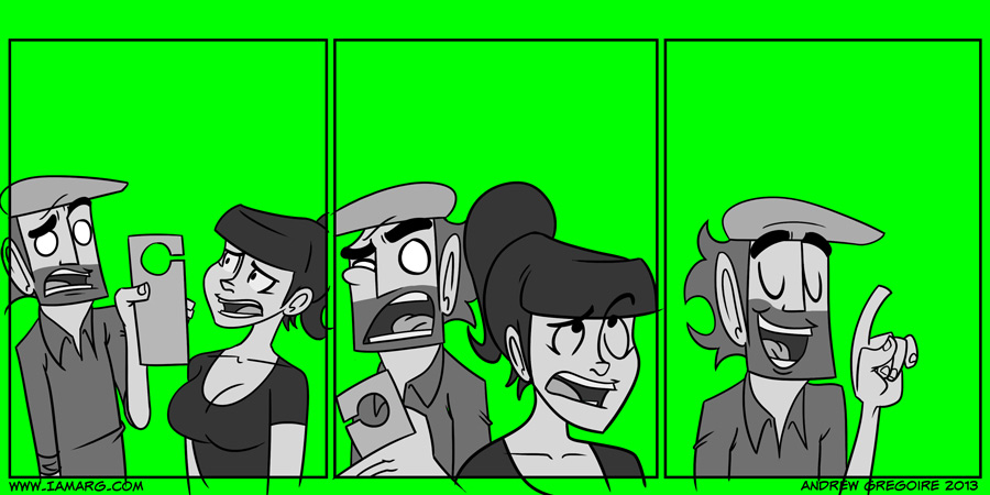
Here’s the finished Flats ready for Shadows and light treatment.
Shading and Hi-lights.
After the flats are done I create a new layer and set it to multiply and it’s opacity to around 50%. I go back to the flats layer and select all the empty spaces, Inverse the selection and then pop back over to the new layer I just created and start painting shadows in using a 75% grey. I’ll be pretty free with the shading as I’ll go back over and erase anything I don’t want. I’m paint subtractive rather than additive with shadows. I pay particular attention to light sources and any sort of drama I want to create.
For hi-lights I create a new layer, setting it to Screen and using the same inverted selection from before, I paint hi-lights with white or another light color. In this case the only hi-light was Lynn’s Hair. I’ll use this layer for any extra rim lighting I may want to add like the rim hi-lights on the Mass effect wallpaper I did.
Backgrounds and Finishing touches

At this point, the character artwork is pretty much done and now I switch to the backgrounds. I usually don’t do line art for backgrounds unless it’s a particularly tricky or important one. So I’ll just take flat colors or grays and paint a simple BG. I’ll full on admit that backgrounds are something I really need to improve on. So please put more effort into your backgrounds than I do. Just remember that they shouldn’t overpower your characters, which are the focus. Unless that focus is the background, then go to town.
After the BG’s are done. I’ll go to the Inking layer and start adding little details and dirt. I also draw ARG’s beard lines in at this point and not during the inking part because it’s annoying to already have them there when I go to select areas for flats. Sometimes I’ll add a layer on top of the inking, where I put things such as the highlights for eyes, Sweat bubbles and other effects like rain or snow. Pretty much If I need to add something I throw it on a new layer.
After this I throw a texture over top to help break up some of the flat colours and to give the whole things some depth.
Word Balloons
After all the art is done, I’ll hand draw the word balloons. I make a new layer underneath all my text and draw the balloons in being careful to not cover the art. This is why I fit the dialogue in as the first step. I’ll then make a new layer underneath the balloons, fill it with white and then select the outer contents of the balloon layer. Head back again to the white layer and then delete the selected white. Name the comic, save it for web at 25% it’s original size and then have the entire world hate it.
And that’s how the sausage gets made!
Some Notes on improving performance.
– Before I sit down to draw I usually like to draw circles and straight lines on a scrap piece of paper for 10 minutes as a warm up. This is an old animation trick that seems to loosen up my drawings a bit and give it some more life.
– Draw smart, not harder. You don’t need to spend a lot of time to make great stuff. Focus your thinking and energy on what is most important. There’s no need to pour details into something that when saved to the web isn’t even noticeable. Plan ahead and always be thinking about how the reader is going to see it. Plan your dialogue. (PACE IT NICE, PLEASE!!! I’ll be writing about that in the writing tutorial) Ask yourself, what is the reader seeing. Ask yourself a lot of questions.
– Practice is the only way you’ll get better. There’s no secret “make awesome” button in Photoshop. I’ve been drawing for all my life and trying to constantly challenge myself. This technique I’ve laid out here will probably be completely different in 3 years. The point is, to never get comfortable with your art. You’ll start to develop bad habits and at that point you’ll actually get worse. If you suck at perspective, don’t shy away. KEEP DRAWING PERSPECTIVE.
– The best way to get better I’ve found is by observational drawing. Observational drawing teaches you how to see your art. To be able to pick out and understand what’s going right and wrong in your art. If you know what is wrong, you can fix it. Training your eye is the best way to improve your art. In fact this skill translates into other art forms. It’s improved my writing, my music making and my animation. Observational drawing is so easy to do because you can do it ANYWHERE. On the subway, at a coffee shop, on vacation. ANYWHERE. There’s really no excuse. If you can get to a life drawing class and you’re not creeped out by nudity, do it.
– Most importantly, just make art. Get over the idea that it’s going to suck. It probably will. But if you keep stressing out about what others think of the quality, then you’re never going to make art and then you’re never going to improve. JUST MAKE ART. And make a fuck ton of it. Read this Blog about getting not giving a fuck and you’ll feel better.
Hope this was helpful folks. The next tutorial will be on writing.

